Tuesday, April 26, 2011

Tuesday, April 19, 2011
Am I a Modernist or Postmodernist?
Po-mo – cliché of modernism
You could argue that not a lot of modernist architecture could be 100% functional
What does it really mean to be modern?
Post modernism could be seen as theoretical
Post structuralism
Situationlist
If you talk about the definition of Modernism with different people everyone will give you a different definition.
Used to note a break with the earlier modernist principles by placing emphasis on form over function, by reintroducing traditional or classical elements or by carrying modernist styles or practices to extremes.
-Seen in art, design, literature, and architecture
- Emphasis on feel rather than rationale
-Emphasis on surface texture and materials
- Self-consciousness or self-referencing
- Mixes high and low
- Historical references
- Vernacular
My parent’s parent’s grew up with modernism lolz
Super graphics popular in 60s and lasted through 70s
Large bold geometric letterforms and placing them in landscapes
Directly confronts modern asthics
Rosemary Tecie
Swiss posters
Have the language of posters but are using untraditional space
Art that can go through a fax machine is kind of neat
Being playful with logo- making art out of logos
This seems like something I would do, very modern, cool idea.
Wolfgang Weingart –
Pushes modern international design before computers.
Works with lead type

Teacher at the Basel school of art
Teacher of important students that become very important renowned artist.
Experimented with letter spacing of san-serif types
Stair-stepping rules
Diagonal type
Reversing type out of bars –
Introducing variations within a single word
Dan Freidman
Died in 1995
-Sampled a variety of letterforms and let them float in space.
-Taught at Yale
samples of art projects kind of looks like things we do in some of our classes today
April Brianmen
- opened a studio in LA
- ad from China club
- Screams 80s
- Influenced by Lysitski
This art of the 80s is all very similar and she had more of an idea about it because she went Basel. In the 80s everyone loved floating things!!! Texture for the sake of texture!!!
Willie kunst
Lots of structure
The Memphis design group based in Milan
Hoped to erase the international style
Pulled all ideas and tried to incorporated it in their designs
Function is secondary to style
Bradley G-T ?
Kit-Cars
Memphis Couch- looks dumb and uncomfortable
70s Art looks kinda epic
rock and roll!
The 80s rock and roll stuff looks more colorful and less epic
Saturations of color
The Duran Duran’s cover was by Patrick Neao
Punk music
Spoke to poor kids in England
50s musicians looked lame and clean cut
Billy Holly next to Jimmie Hendrix
Reaction of more of a clean cut and style
Malcom McClairen
Retro 50s clothes salesmen
Like Situationists – (has nothing to do with Jersey Shore) kind of like Dadaists
Developed the Sex Pistols formed in 1976.
Buzzcocks- poor kids from Manchester
Very un-Modernist ideas of design in their album art.
Paula Share
1984
Riffing off of Dadaism and Futurism
Charles Anderson
CSA Associates
Repackaging cultural language.
Procreated vernacular
Not clean not modern very rustic
Work by Peter Saville

I love this piece I really want a T-Shirt with this design on it.
I might buy one
Von Oliver
English designer
Responsible for the language to 4AD records
Mac ad in 1984
Technology on design was so great!!!
April was one of the first people to adopt this idea
She challenged the new trend with her traditional ways
Émigré Magazine are super rare. Buy them if I see them on Ebay
DAMN THEY ARE LIKE $70s a piece!!!!
David Carson!
Beach Culture or Ray Gun –buy them!!!!
He had a different idea of reading space and type
Very postmodern
He gives lectures I can find online
Sagmeister
Carved his typography into his own body. It was neat but it looks very painful.
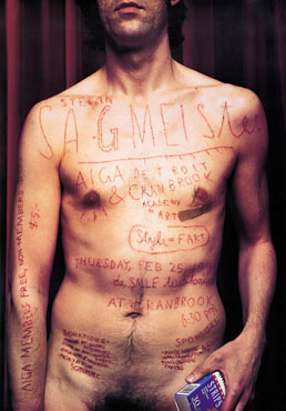
Very postmodern!
Known for handwritten typography and making his own type
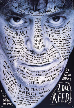
I have one of his books and to be honest I wasn't very impressed with it except for his poster design and the actually book design itself. The book itself is very interesting but more of a fine art type of project and less graphicy. The idea of Fine Arts and Graphic Design sometime touching each other is one that I really enjoy myself. I came to this school originally for Fine Arts.
Post Modernist argument
That when they create a work that is repulsive because they claim it is more emotionally engaging then Helvetica in the Modern style. But it also argues that maybe it is very functional like modern art.
He took off a year to just make art. I bet when I am a working graphic designer in the future I would love to take a take time off to create art and think of design.
His art is neat but not very new – hand writen types
David kipd-
Wrote Cheese Monkeys- interesting look at designers
Wrote follow up - The Learners
Designs book covers
Dorian thinks everyone is competent in Graphic Design, which maybe true
The Diva poster is kind of neat.
I think that this lesson is kind of inspiring for the future. I think that I will be more than a competent artist. I want to say I am very in the middle of the post-modern and modern stereotypes. I always try to switch up my projects and do something different from the previous projects. As a Fine Artist even I am very innovative I think but as a Graphic Designer I am very traditional I feel. I think that I am always trying to try new things and I take in a lot of my environment into my designs. I am very observant and I love looking at other designer’s work.
Tuesday, April 12, 2011
It is more than just grids!!!
Swiss Design + the international Typographic Style
It is more than just grids!
-Visual unity with asymmetrical organization
- San serif type
-Objective photography
-Mathematical grids
-Socially useful – like constructavism
Swiss Deign-
More important than the appearance, is the attitude!
Design as a socially useful and important activity!
Being a designer is being a snob being an elitist
Di stil – Bauhaus – typography
The starters
Max Bill- died in 1964
Theo Bomber died in 1994
1928 profession exhibition poster
-grid as art
-grid becomes the art
Poster by Max Bill
-For a Museum
-Grid made by stars
The skeletal stucture of Grids add logic to the piece of art work. I love working with grids but I should do it more often
Book cover
- Made by Max Bill
- Asymmetrical design of text
- Shows typographic higher achy
USA baut
- Made by Max Bill
- Uses Geometry
- Very organized
- Asymmetrical
In 1950 Max Bill was important in the planning of the Ulm
- Semiotics was important to the curriculum
Semiotics – what things mean in relation to other things
The idea of this is really cool I’ve never really thought about symbols this way. It is an interesting thing.
The philosophical theory of signs and symbols
-What things mean in relationship to other things
Sytactics – order
Semantics – meaning or referred to
Pragmatics – how it is used
Ferdinand de Saussure
Dyadic model
A signifier-the form which the sign takes
-the ‘signified” – the concept it represents
Charles Sanders Peirce
The dots example is really interesting to think about
Juxtaposition is funny some times J http://www.uproxx.com/feature/2010/08/fifteen-funny-advertisement-juxtapositions/
Adrian Frutiger –
Born in 1928
Made the Univers typeface in 1957
Leads into Helvetica
Armin Hoffman (the guy that Dorian called AIGA to find out if he was still alive)
I’m sure he will be the first one to know if when he is dead
I will do that with my son lolz
Died Born in 1920
The Giselle cover

If you design the negative space the rest will fit
Hand lettered logo for some theatre
1964 swiss thing
1962 poster for Herman Miller
form is opposite of text
Joseph Muller Brockmann
Died in 1996
Semiotic relationships
Handshake poster
- Helping hand?
- For Swiss Auto Club
- Intense and clear
- Intense and universal graphic expression
Weniger Larm
-Imagery shows that it is too loud
-Type declares less noise
Film poster
You can clearly see the grid
Dominate horizon and vertical
Negative space contributes to the composition
A good grid has flexibility – this reminds me of Tron and the Grid!!!!
He did a few concert posters – all using a system of proportions and a grid
Modernism
European Modernism is theoretical. Full of thought. How can I better society?
We are not like that we are a pragmatic people.
What is the concept what are the big ideas
Paul Rand
Saul Bass
Ivan Chermayeff
New york school developing in 1940s
The economy is growing back from the war – I wish the US would do this now

1940 Paul Rand

Decoded – decoration
- Christmas paper
- Bullet holes
- Barb wire
It’s a cover for direction magazine
Language of both War and Christmas
The name of the magazine is being revealed by the tearing away of the wrapping paper.
Cover from 1945
Cupid with bullet holes
Leave canceled
Dots are very common even in my classes such as Image in Color and sometimes in Intro to GIC
1955
Paul Rand used simple imagery
He frequently signed it
Some designs of his were cut paper
Did the original UPS logo

The designers were furious!!!!!!!!!! The logo is pretty ugly :/
I thing the logo for Fed Ex is nicer J
Although Paul Rand was kind of a cantankerous old man, he was a fantastic artist and designer. I find that many of his artworks are very inspirational. Forms are not what makes are is a great quote that makes me think about many of my designs and how I use form very freely and don’t think about how to use it in another way. I really enjoyed this lesson because in my web design classes we are currently looking at Modern posters for an interactive posters and I might look over some of my initial ideas to make one of his posters interactive.
Saul Bass

Movie poster for The Man With The Golden Arm

Spike Lee ripped off one of his posters for his the movie Clockers
I know about Saul Bass because of his Mock Inception posters

the Song from the film opening sequence designed by Saul Bass is the same song from Lady Gaga’s new music video’s opening sequence to her song Born This Way
Saul Bass
Lady Gaga
Ivan Chermayeff -
Still alive and gives talks every once in a while
Talked for 45 minutes about a dot- in the most lyrical way
Speaks in lyrical child like way
Son of a modernist architect
Used a lot of own typography and collections

When ephemera are collected they assume a new meaning
Used dots to express other meanings of objects
Very interesting way of thinking about design
I have downloaded Helvetica on my Computer J
Tuesday, April 5, 2011
The New York Mafia- The New Jersey Shore
Weimar
Where it starts
First public exhibtion
Letters of resignation
Dessau
Golden years
Berlin
end of Bauhaus :(
(stupid nazis)
end of Bauhaus :(
(stupid nazis)
Utopian desire to create a new spiritual society
Unity of artist and craftsmen to build for the future.
Ideas from all the adcanced art and design movements were explored and applied to functional design
Groupius- 1st leader
Bayer-alphabet
Paul Klee
Moholy Nagy
Johannes Itten-1st foundation teacher
Herbert Bayer
Kandinsky
Mies van der Rohe- last leader
Walter Groupius-1st leader
Oscar Schlemmer
Joseph Albers
Jan Tschichold
Un-German typography
Soviet posters he had collected
He was arrested and eventually ran away to America
In what way is Jan Tschichold like Talwn Morris, Elbert Hubbard (Roycrofters)?
Herbert Matter
this is really cool lots of cool new ideas
I hope the movie comes out cause it was filled with neat ideas for logos
He pioneered the idea of photomontage in poster design
Extreme perspective shifts and scale
Swiss tourism
Swiss flag
Diagonal lines
Paula Share
The New York mafia - (they should make a reality tv show called this)
Ripped off the Swiss poster for Swatch Watches
San Serif typography
Abstract modernism design
E.E. Cummings pages is really neat and creative. I love the way this looks
Lester Beal –
Dude likes arrows lolz they look really look neat
Old wood typography looks very neat and modern for the time
I could never imagine a life without electricity
The running water poster is very simple and very effective in its design
It looks cool
The graphic representation of flag is very subtle and works very well and neat
Power for defending our homeland form aliens
By supporting the art you support everyone
Robert Muchley
Port of Philadelphia
Color wood block
Katherine Milhous
Exhibition WPA federal Art project Philladelphia
The calendars by Dux are really modern looking – I want one in my room. I should make one for my family next year for Christmas.
Modern design moving away from Victorian ideal
Some poster really look like Kassander
Sutnar
His work is really cool very Ray like?

Produced with no passion only formula
Helvetica from 60-70s
The graphic design in this time period is very nice. I generally like all of this work. The minimal color use and such is something I really like and I want to design more posters and stuff using these ideas. David Carson must really like this style because a lot of his art looks like some of this work. I could never imagine Helvetica not being a popular typeface :(
Tuesday, March 29, 2011
Bauhaus is apparently a huge deal
I mean I guess its kinda cool – I want one of Dorian’s shirts

How can I model the ideal life?!
Bauhaus 19-19 – 1933
1919-1925 in Weimar
1923 first public Exhibition
1924
Letter of resignation
1925-32 Dessau
1928 Gropius replaced by Meyer
1930
Meyer Replaced by Van der Rohe
1932-33 Berlin
it only lasted 13 years
it is where we get teaching of design principals
*This is neat because it directly relates to us as students here at Ringling without this school the education for design would be completely different.
Film
Bauhaus-Broken wings
Apparently Dorian cries every time he watches this – lmao
So far it has nice music, setting an artistic calming mood
The Nazis SUCK, why do they ruin everything?
This movie is really sad I don’t like Nazis even more now L
If art school closed down I wouldn’t know where else to go, I would probably work at Subways so at least I could be a sandwich artist.
Art school used as a cornerstone of revolution
Walter Gropius is the Main guy
1st director of the Bauhaus
From 1919-1928
Wanted to return the old arts and crafts
Published a Manifesto of the Bauhaus
Incorporated a woodcut of a cathedral
Much like Ruskin idolized the cathedral
3 spires represent
-painting
-sculpture
-architecture
I somewhat agree with this but now digital media of course should be added
Involving all forms of art and
Council of masters
-Gropius-leader
-Gerhard Marks
Sculpture/pottery shop
-Lyonel Feringer
Painting
-Johannes Itten
Preliminary courses
Itten first weird art school teacher (AKA Dorian)
Wanted to release art student’s potentials, establishing you as an artist
Harnessing each students individual creativity
Understanding the use and misuse of all media
Studying based on contrast
Analysis of old time masters
Assemblage –made of found objects
Because they used what they had
No rich art students when here
Very unlike Ringling – maybe some students here would appreciate art more if they were in this time period.
Itten leave the Bauhaus in 1923 –also the first exhibition
He left because the ideas of design changed and it was more dependent on designing for the machine, he also had Communist tendencies
Gropius didn’t want Van dos Berg to teach at the Bauhaus
http://www.heidihysell.com/blog/wp-content/uploads/2010/01/EP_BAUHAUS-2.jpg
Joost Schmidt- Poster that influenced by superemitism and constructivism
Nagy
Hungarian constructivist -Worked with resins, photomontage
Soon became Gropius’s right hand man
Typephoto says that photography will run out painting
Much like German Designer Bernard who did Plakashtil
Photogram

Photoplastics
Pictorial expressions
Due to tensions in the city they are forced to leave in 1926
Oskar Schlemmer

Roy lichtenstein

They both did what we have to do in art schools today, draw perspective of the school’s buildings and halls
I hated doing this in my class cause I don’t enjoy drawing with perspective unless it is with a ruler.
Student made furniture and such
Cover of Bauhaus
Shows you everything you need to know
Integrates type and elements of Bauhaus
Shows geometric shapes and principals of school
They did a series of books of which they talked about not only their school but also other relevant artist.
Herbert Bayer
Made a universal Alphabet - not to be confused with Universe typeface
This has flushing on the left and racking on right
Contrast and higher achy
Bars rules and squares
Got rid of serifs
Strong vertical compositions
Kandinsky’s 60th birthday
Implied grid
Shifted from horizontal axis
In 1930 Van der Roa took over
“Less is more”
This lesson was very interesting and I really enjoyed learning more about the Bauhaus. This school I feel is something that all art students, not only graphic designers, should learn about. The film Broken Wings is a film that should be shown to all art students to make us appreciate their talents more and help us realize how lucky we are to be in an environment that is so nurturing to our creativity.
What I know about the Bauhaus
I know that it started in Germany. I also know that it was one of the first graphic design schools. If I remember correctly it didn't last very long and I think it was because of War.
Tuesday, March 15, 2011
Pen is Mightier than the Sword
El Lissitzky
Influence of the Pron
Black bars come into play
I love Mondrian and his black bars lolz
USSA- iconic poster – very referenced
He is working as a constructionist
Its kind of ugly and dark
Functional design – very organized in inorganic spaces
Photo montage becomes popular because photography is very modern and new and people want to utilize it
Montage in cinema
The Battleship Potemkin
Eisenstein
Propaganda film for communist army
Class distinction
Montage of layering images
One on top of the other.
Like in recent lady gaga videos lolz
-this video is depressing and I don’t really like it!.
oh shit the royal guard is coming!!!!! COMPLETE CHAOS!
The untouchables movie with the people in NY shooting at people and the baby falling down the stairs
People steal these kind of idea even today with people like Quentin Tarantino
Very intense and kinda cool
Rodchenko
Born in 1891
1910-1914
Lines made by a compass very cool
Process work was very important and drawn out
Flat forms and black bold lines

Pure red color pure yellow color pure blue color
Oil on canvas
Painting with logical conclusion
Black lines seen again in war posters
Pen mightier than the sword
1932 Stalin came into power and art was abolished – communism is dumb!!!!!!!!!!!!!!!
Rodchenko doesn’t make “high art” but because it has function it has a common good and is helping the economy AKA the greater good
The cookie box has a Hexagon = favorite shape
State airline poster is nice and clean
De Stijl _ The Style
Movement started in the Netherlands
Utopian view of aesthetics
Art that is theory based that is about morality of functionalism
What is the true essence of art?

Characteristics -
-Rectilinear planes
-No surface texture
-Pure primary hues
-Black and white
-No illustrations
Universal harmony of art
Best example of an artist
Mondrian –

Theo Van Doesborg – founder publisher

Applies to -
-Architecture
-sculpture
-painting
-Partridge family bus lolz
This is one of my favorite types of art – very clean and orderly
1941
Asymmetrical composition is introduced!
PIVITAL FOR MODERNIST DESIGN / COMPSITION
Rayonism lolz
http://en.wikipedia.org/wiki/Rayonism
Rayonism isnt that cool, i wish that it was cooler...:(
I really like De Stijl. I once did a whole theatre project on it for some play. I really like Mondrian and I find it funny that we never really learn about Rodchenko in Art History when he was such a pivotal person in Netherlands's history. I love this style because it is very graphic design based and I like the idea of design with primary colors and linear design. This class makes me happy :D
Van Gogh tree
Impressionist tree
Cubist tree
Rayonism lolz
http://en.wikipedia.org/wiki/Rayonism
Rayonism isnt that cool, i wish that it was cooler...:(
I really like De Stijl. I once did a whole theatre project on it for some play. I really like Mondrian and I find it funny that we never really learn about Rodchenko in Art History when he was such a pivotal person in Netherlands's history. I love this style because it is very graphic design based and I like the idea of design with primary colors and linear design. This class makes me happy :D
Subscribe to:
Posts (Atom)